
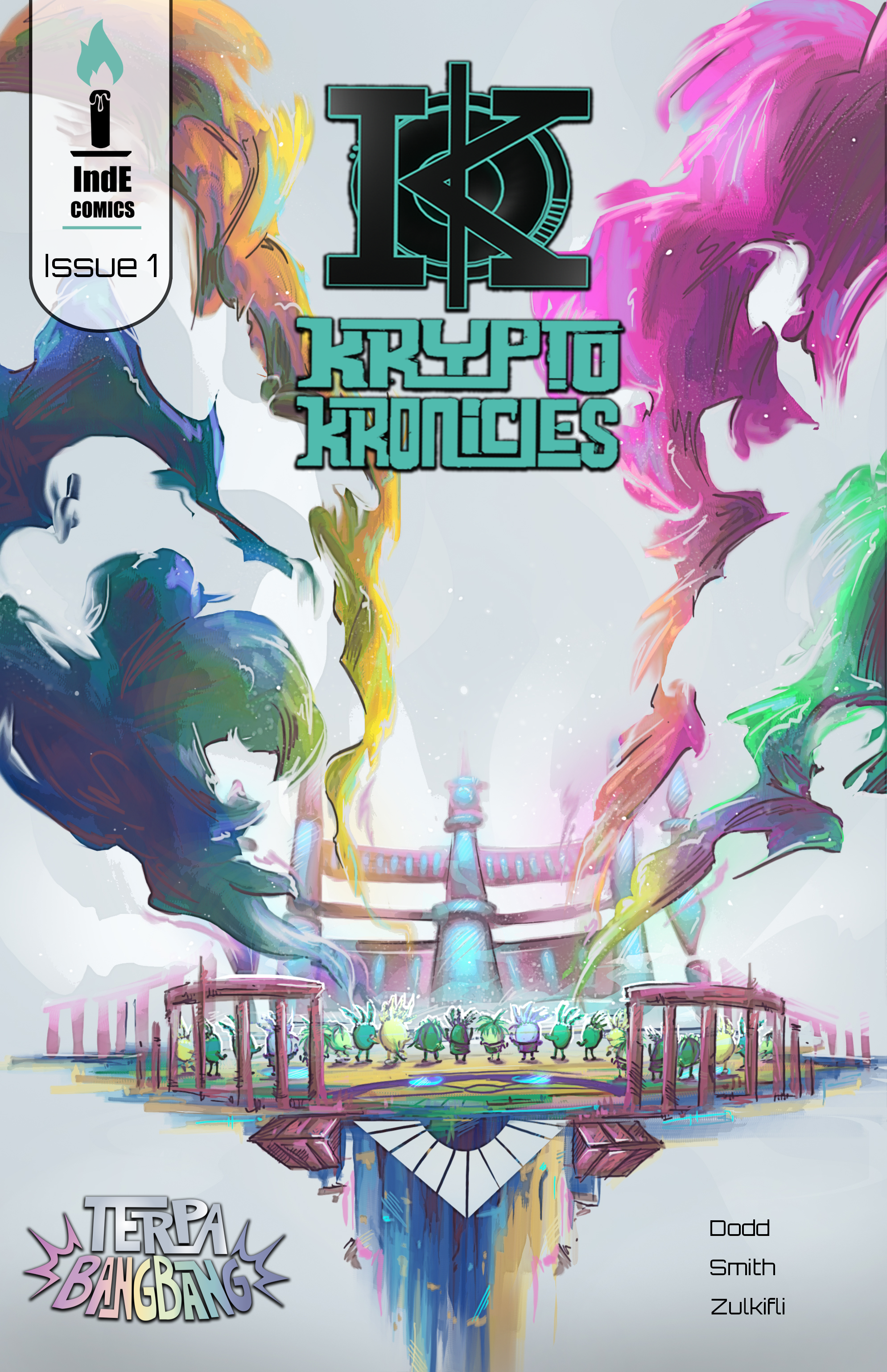
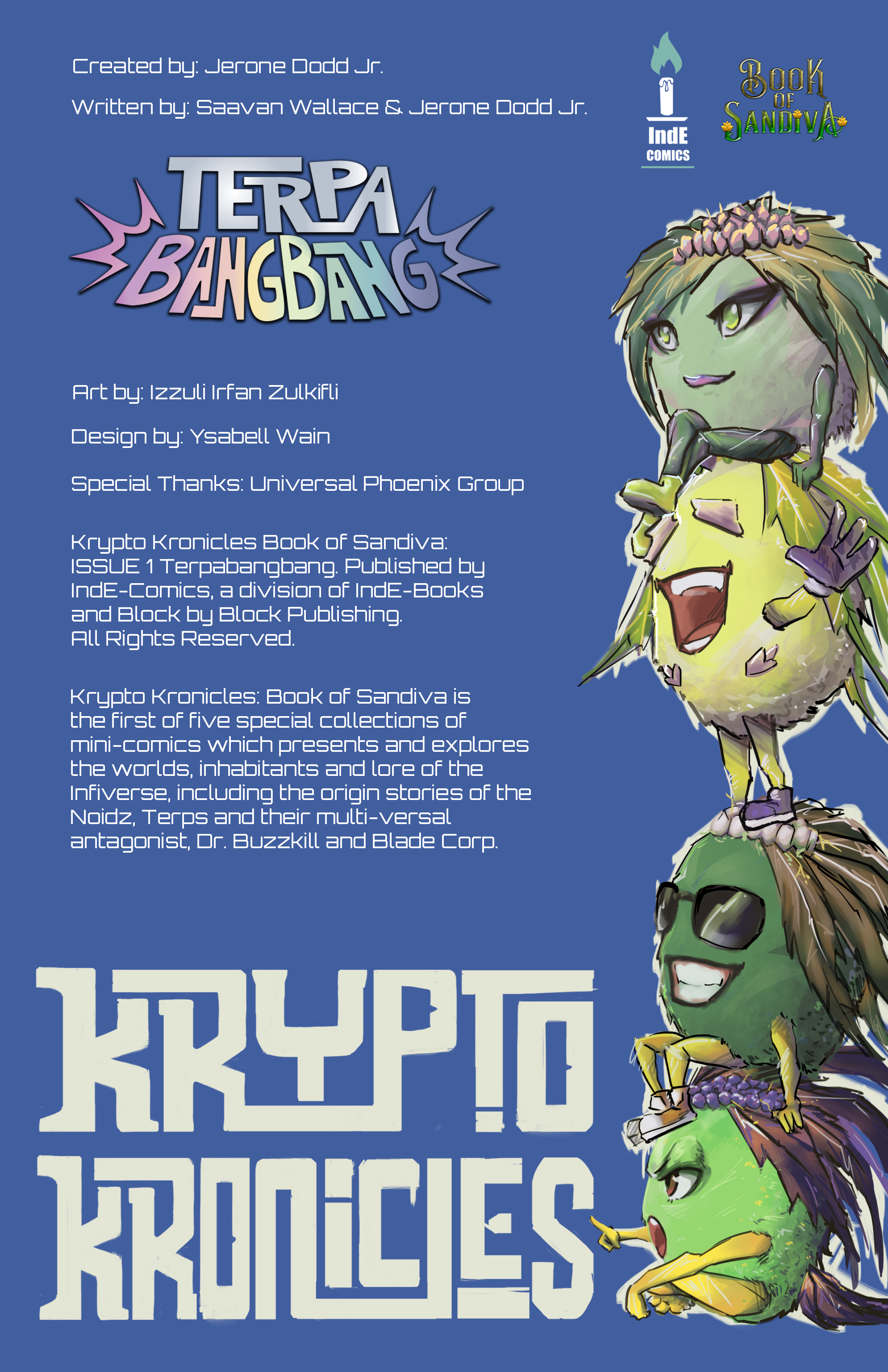
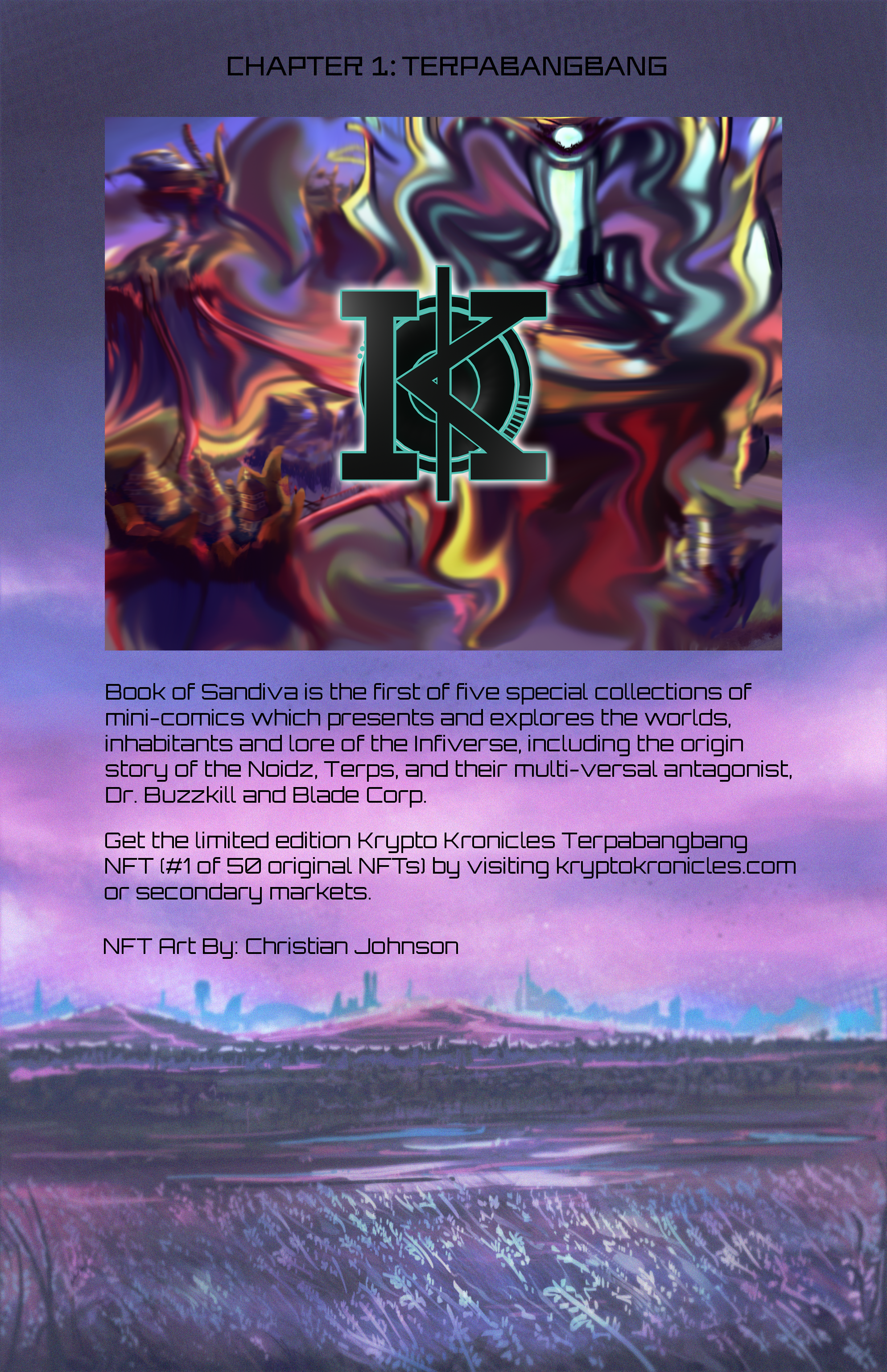
During my first internship in summer 2024, I worked for Universal Phoenix Group LLC on various graphic design projects, including the first edition of the Krypto Kronicles comic series. Through this project, I designed the logo and cover for the title, “Terpabangbang”, as well as typeset the credits and promotional pages. I also storyboarded the game trailer for the company’s other project, STEAM Dreams, an educational children’s video game, which you can view here: https://store.steampowered.com/app/3249420/STEAM_Dreams/
Krypto Kronicles 1: “Terpabangbang”
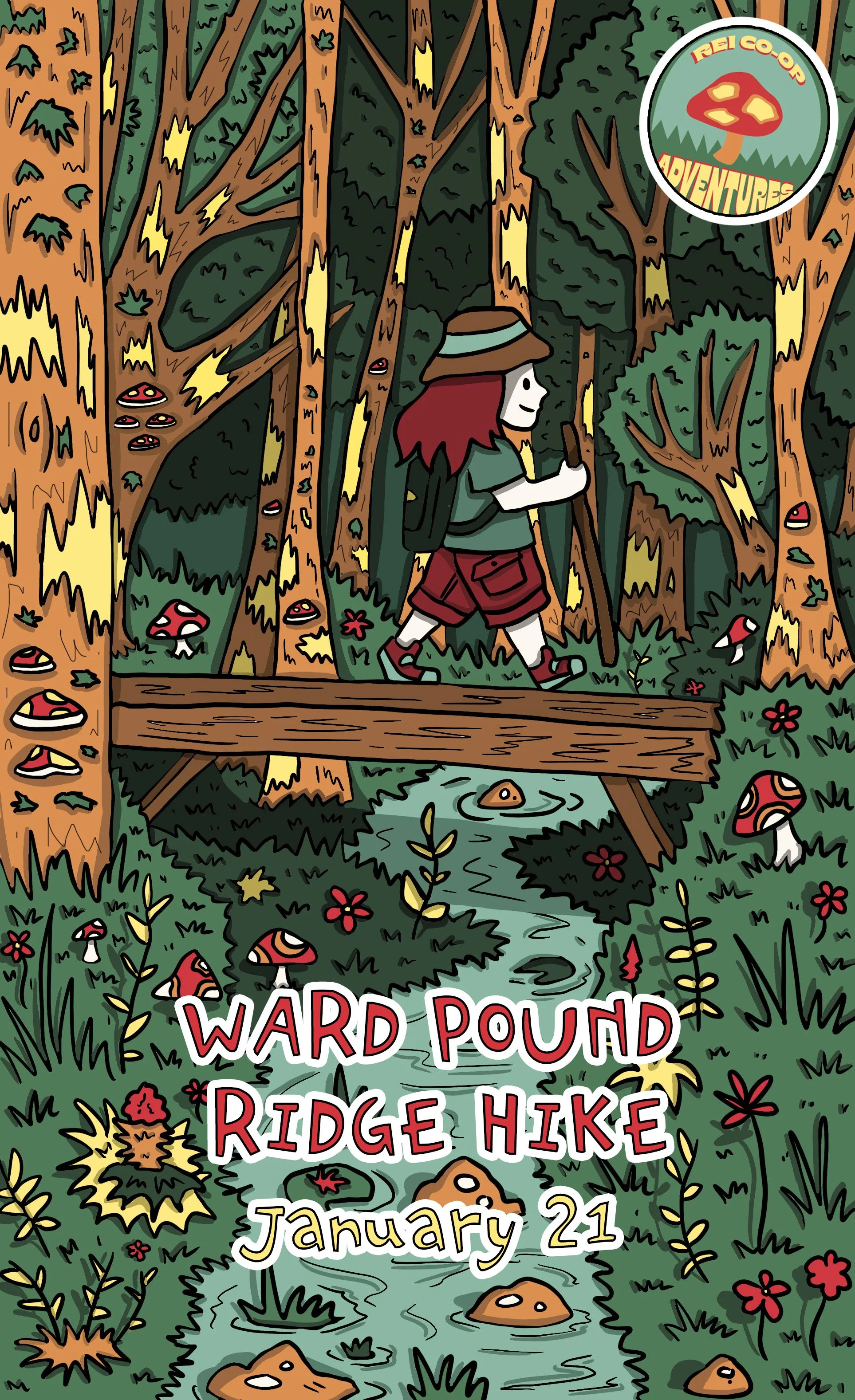
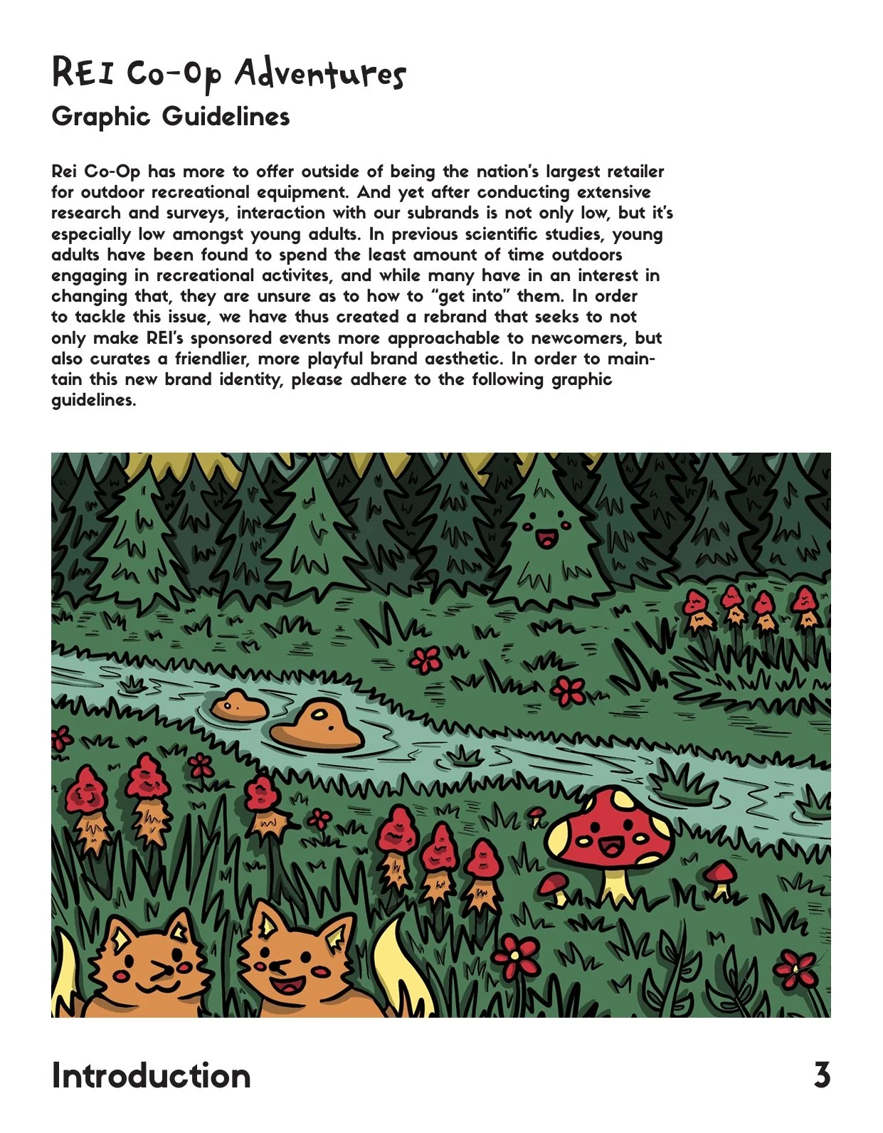
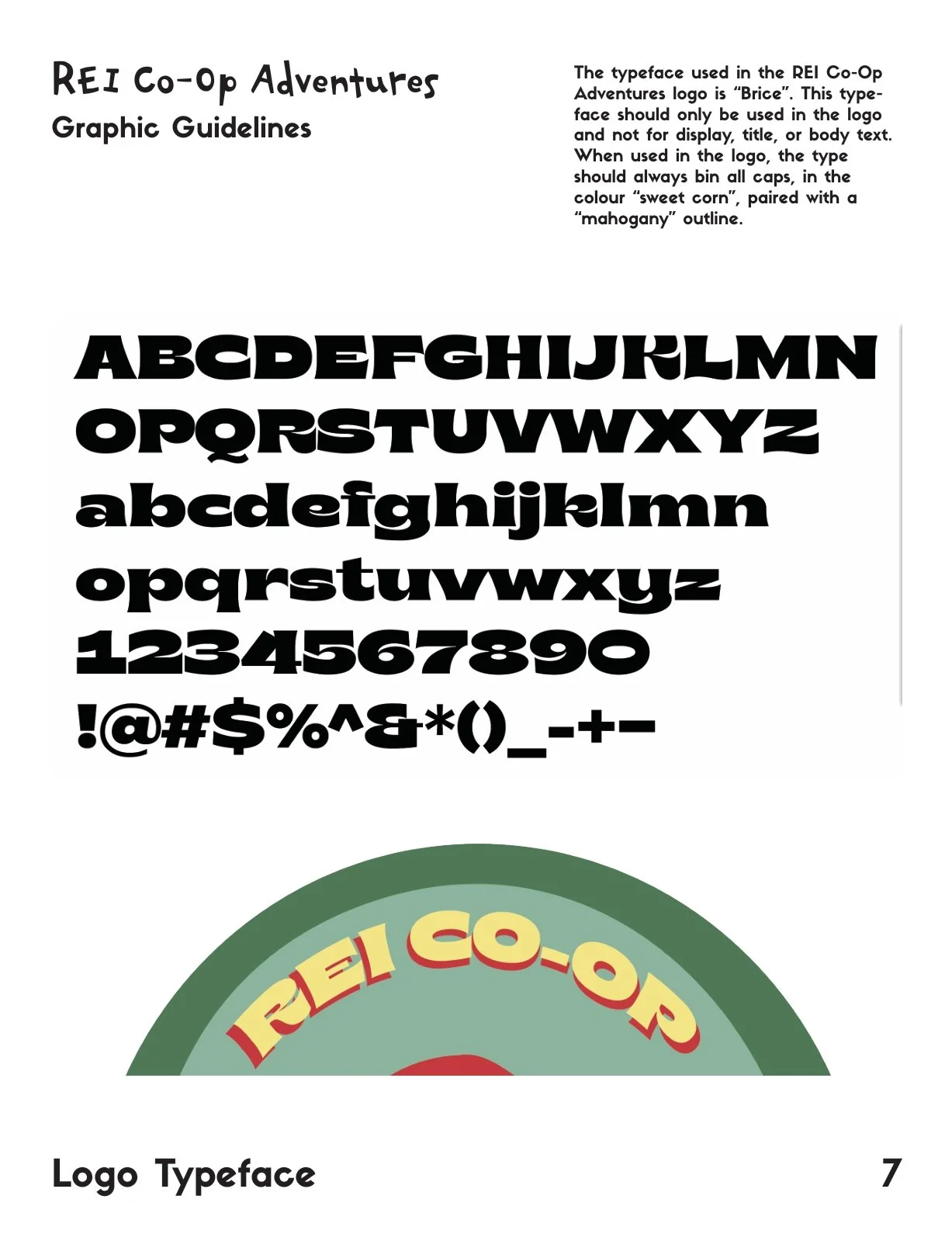
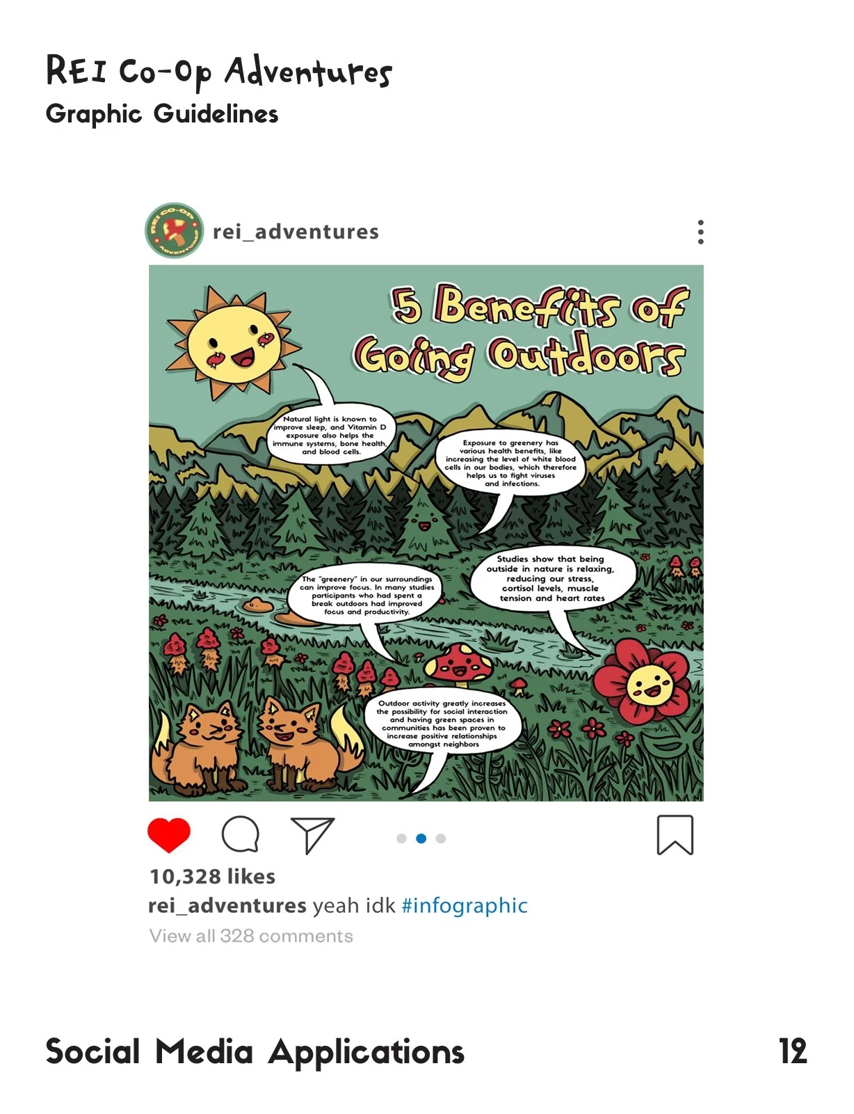
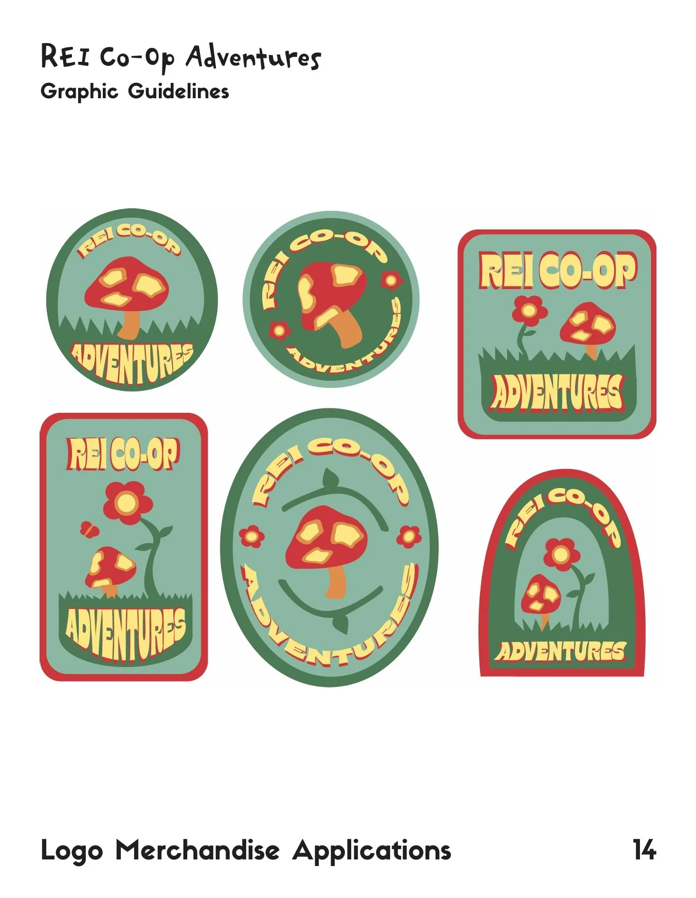
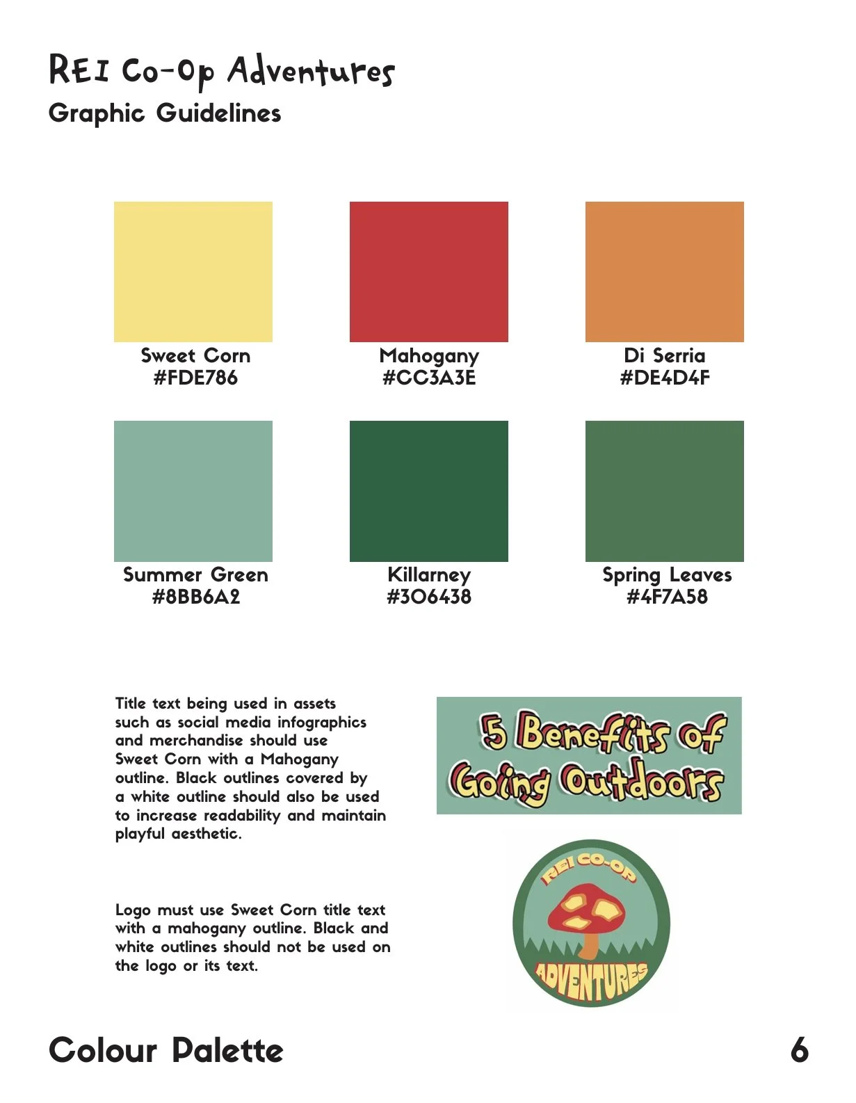
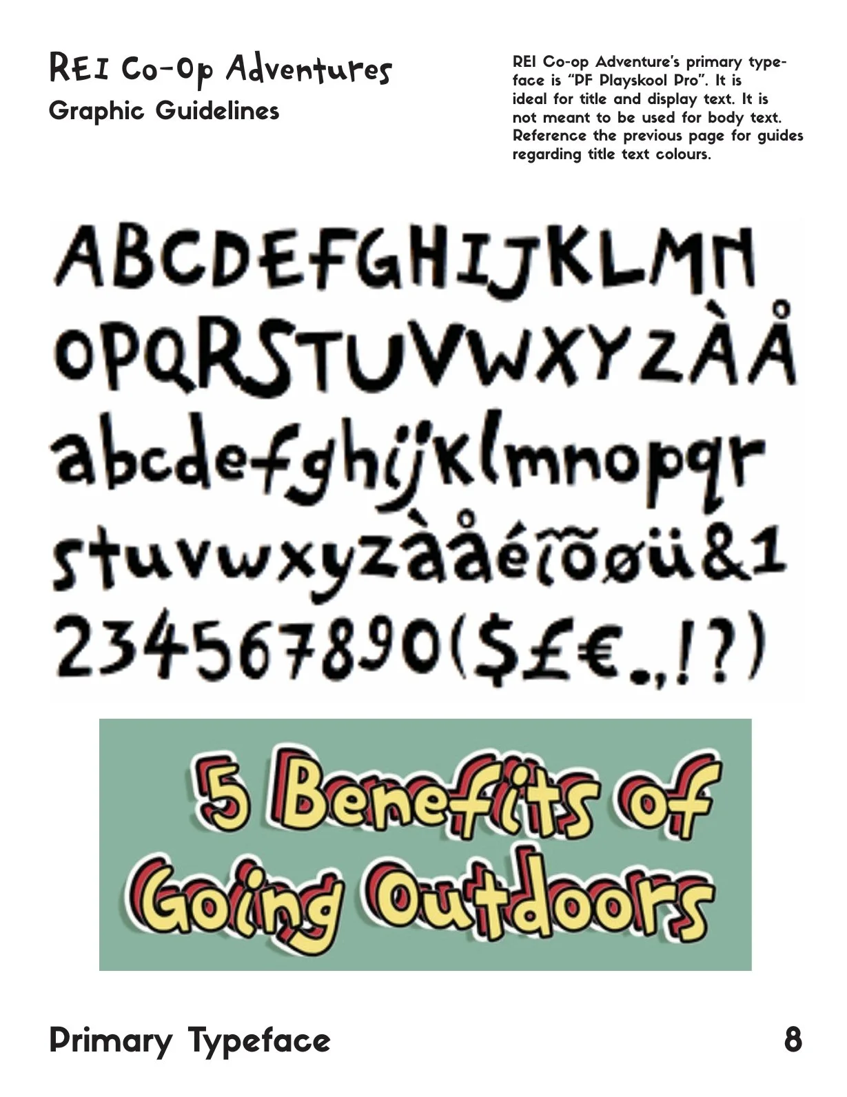
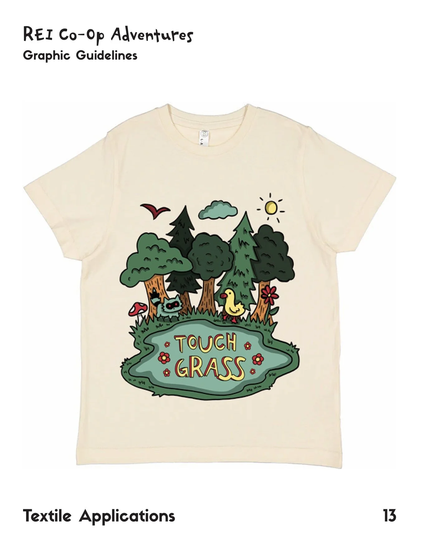
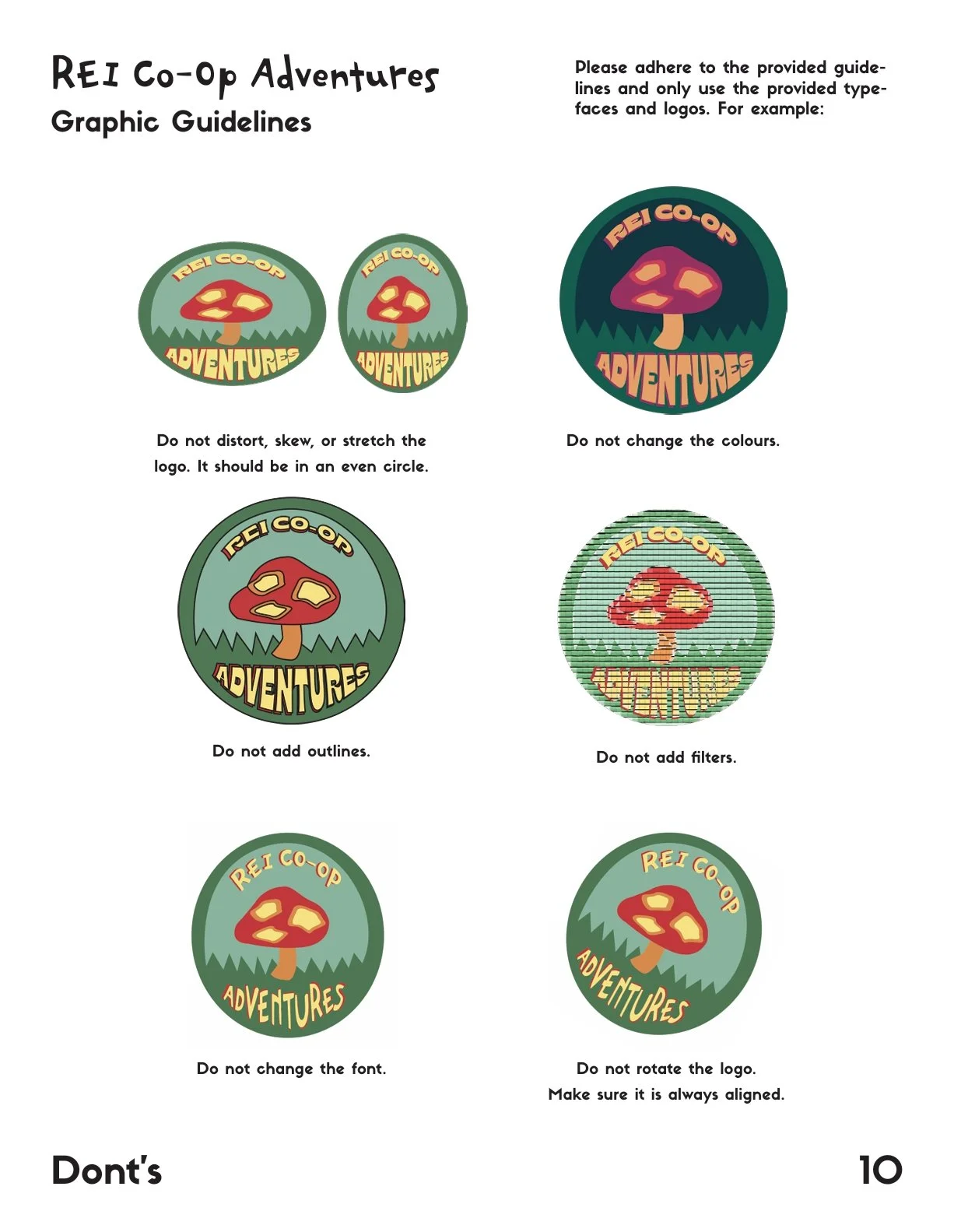
As a communications design student, I had to take a Branding and Messaging class during my junior year at Pratt. Throughout the semester, we completed various projects relating to a specific brand, mine being REI Co-Op. Our final was a company rebrand, so based on my semester-long research, I wanted my rebrand to have accessibility in mind, specifically pertaining to the company’s initiatives to encourage people to go outside, as well as appealing more towards a younger demographic. As part of my deliverables for the final, I made a full brand manual for a redesign of REI Co-op Adventures. The idea was to transform this brand into having a more whimsical identity, in order to better appeal to younger demographics and those who don’t already participate in outdoor activities regularly.
REI Adventures Rebrand Manual
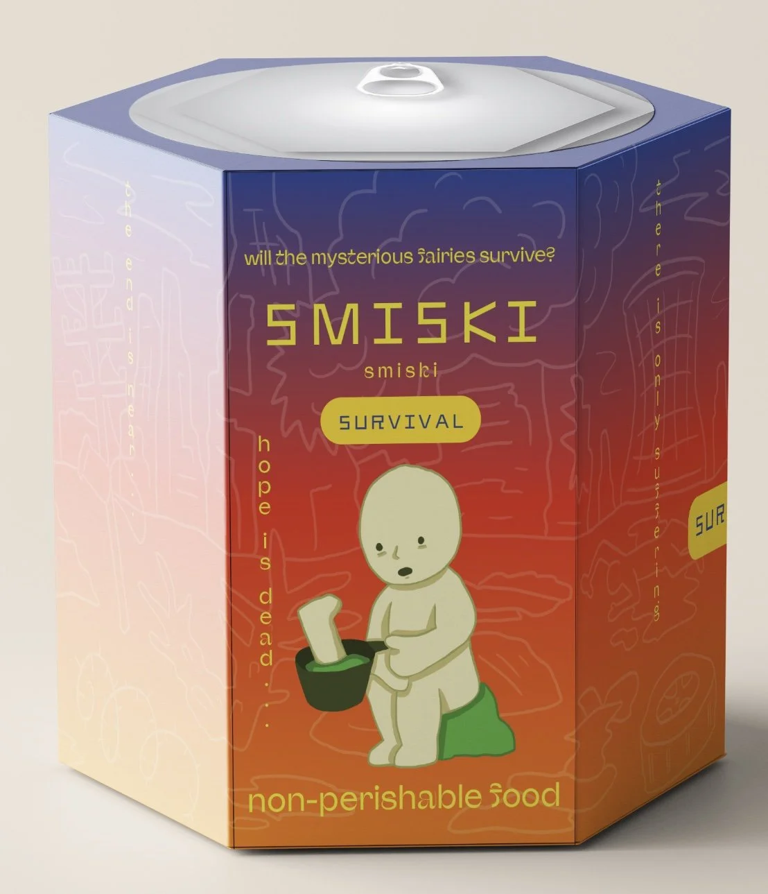
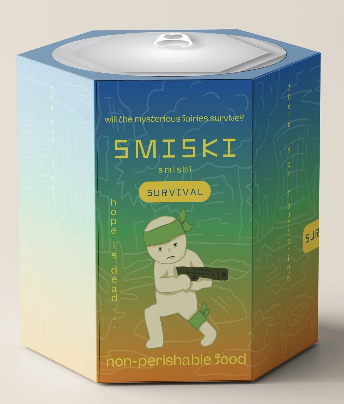
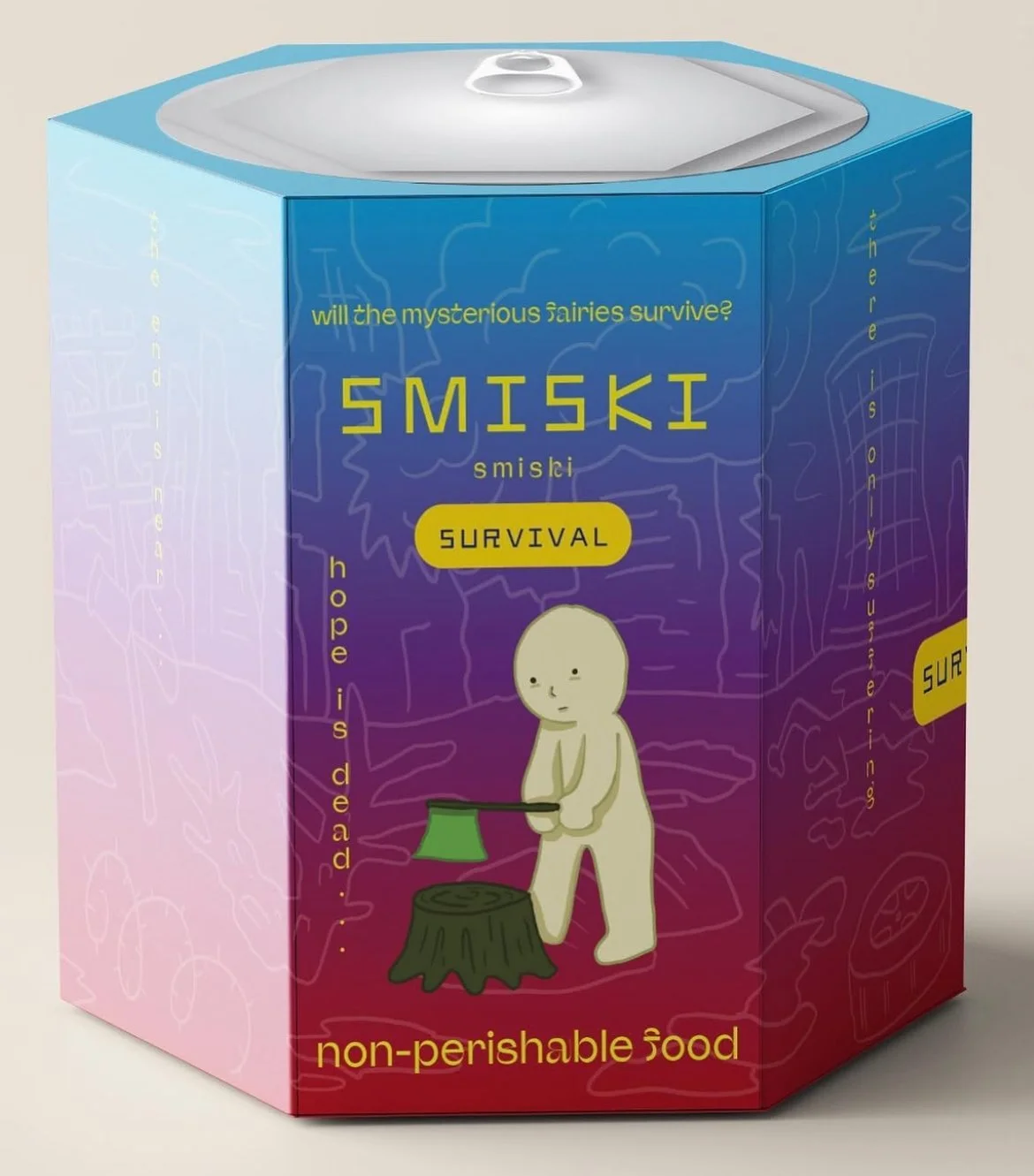
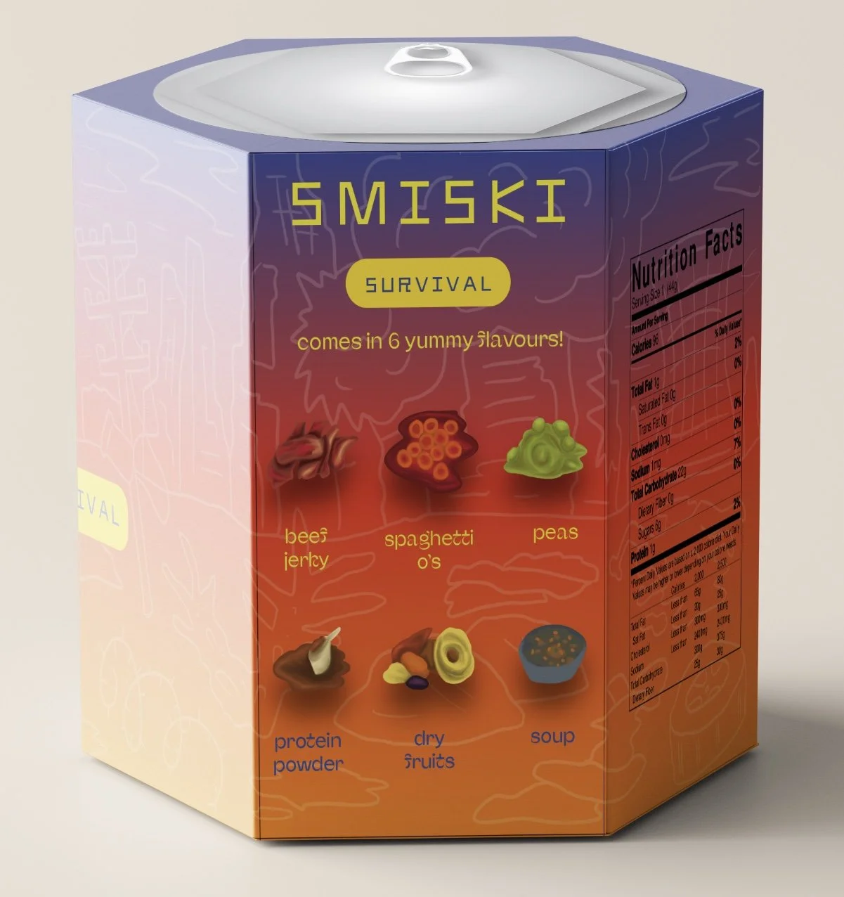
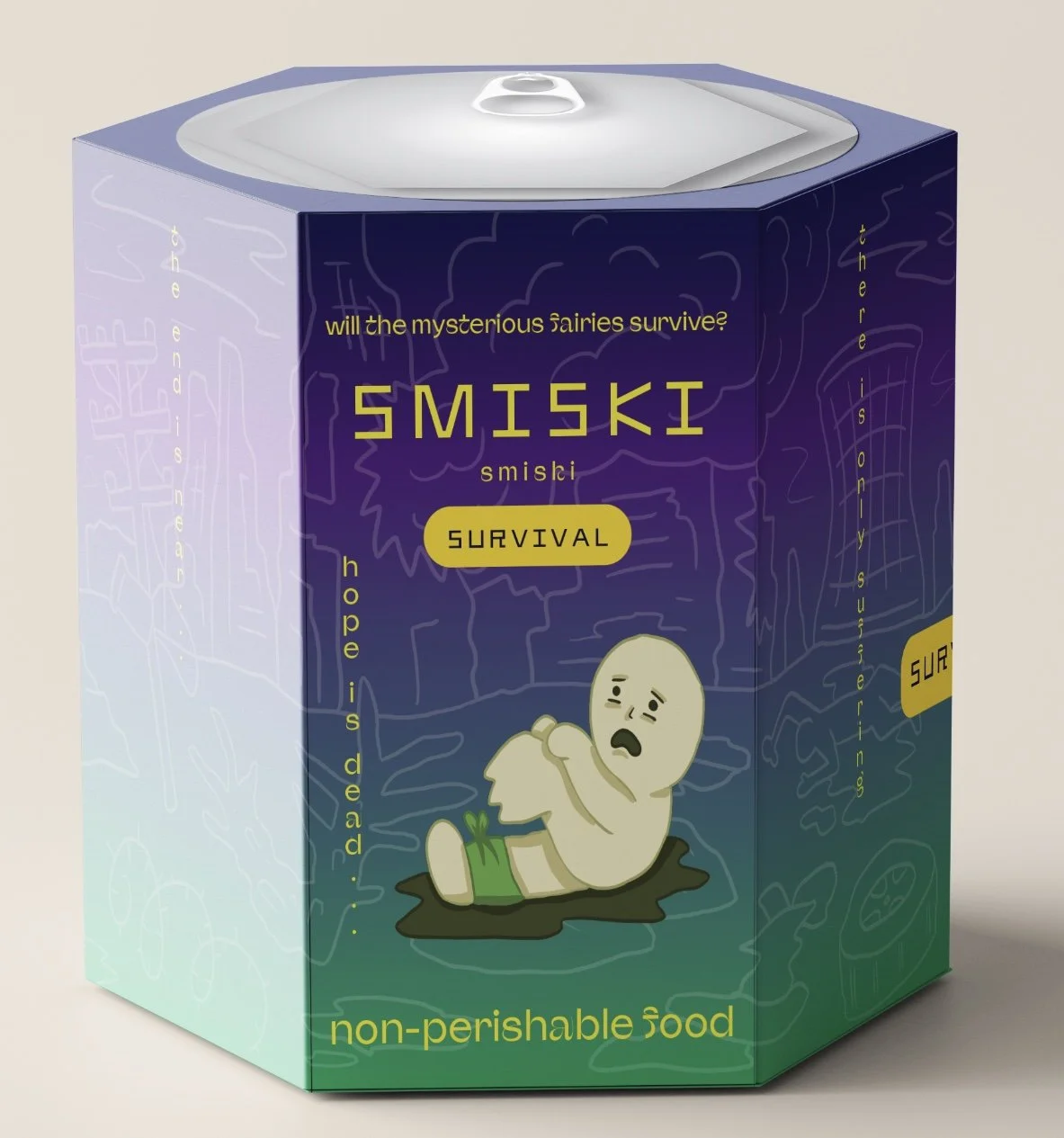
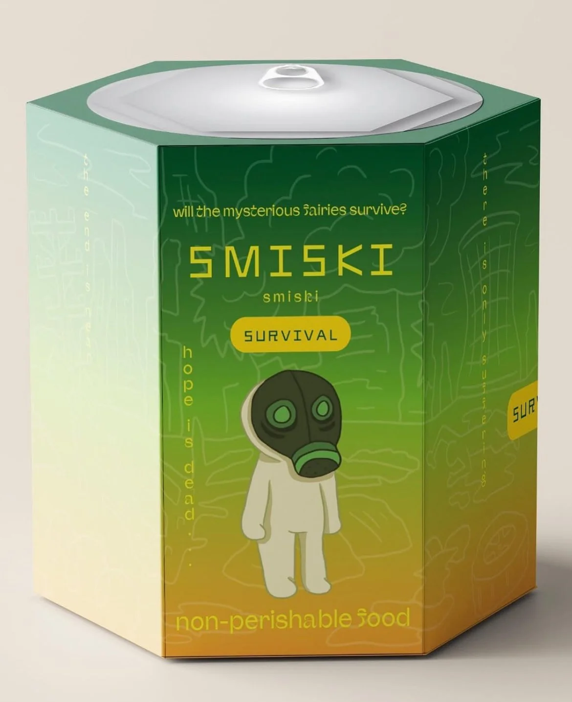
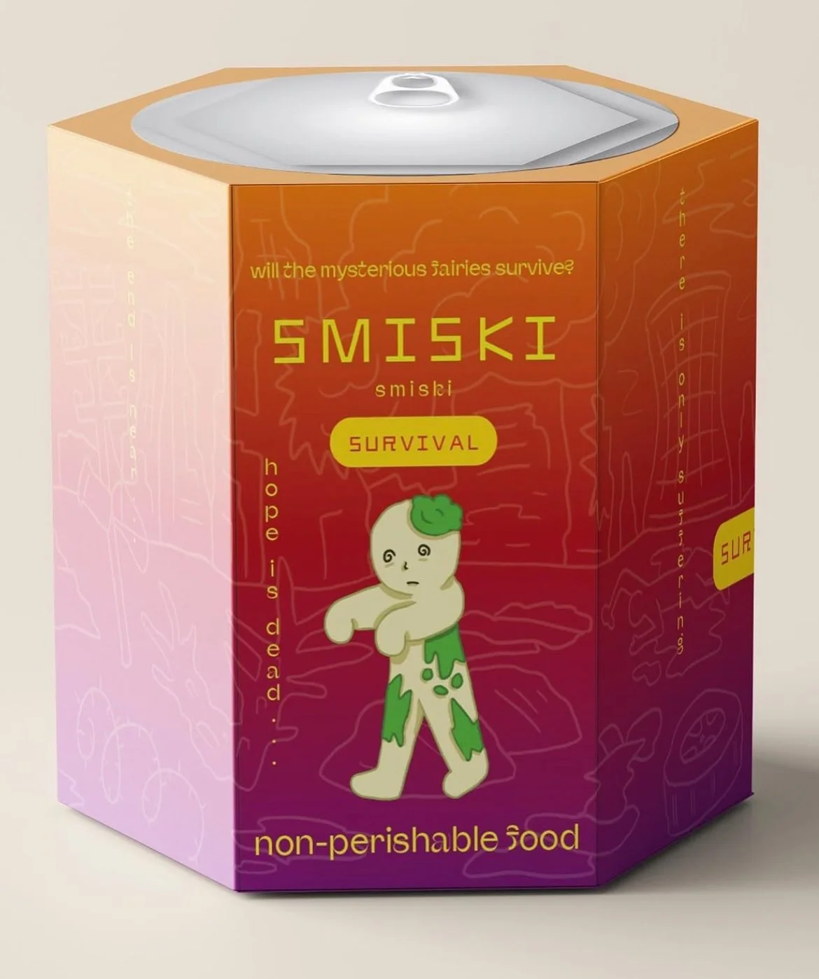
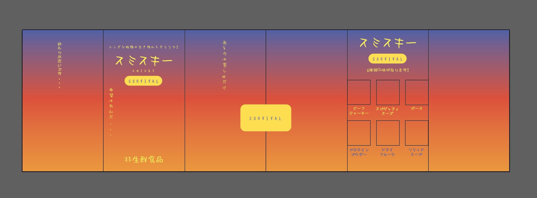
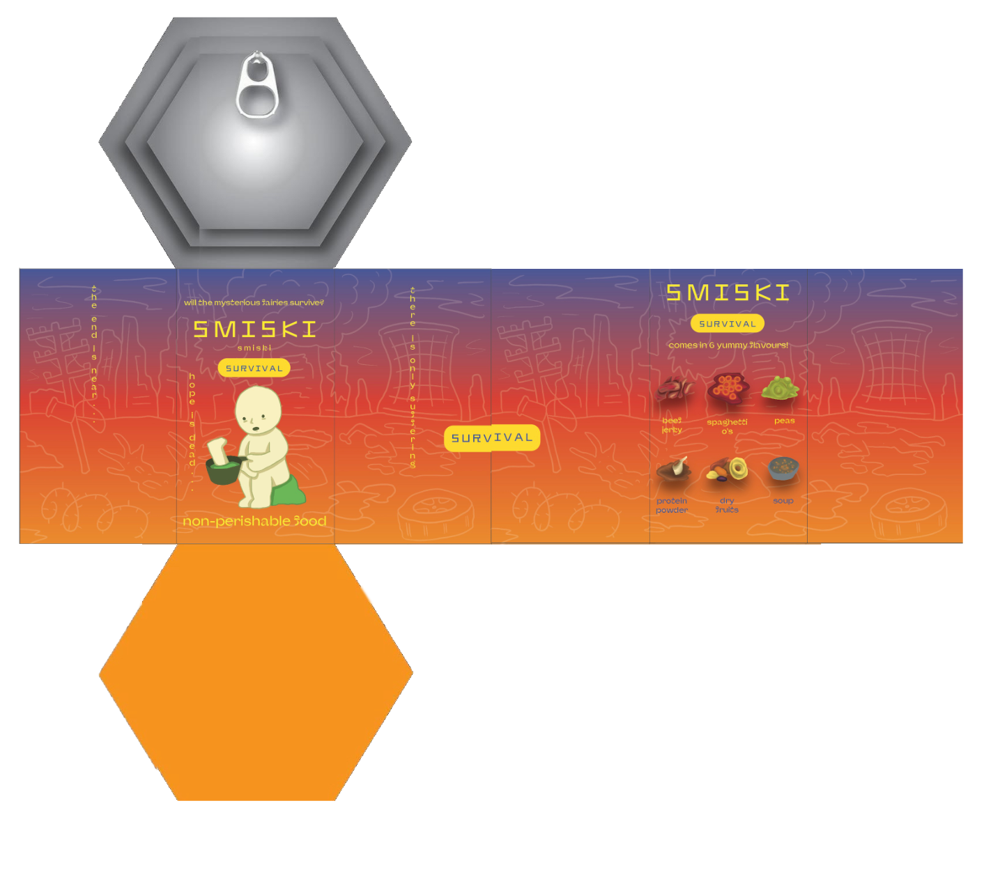
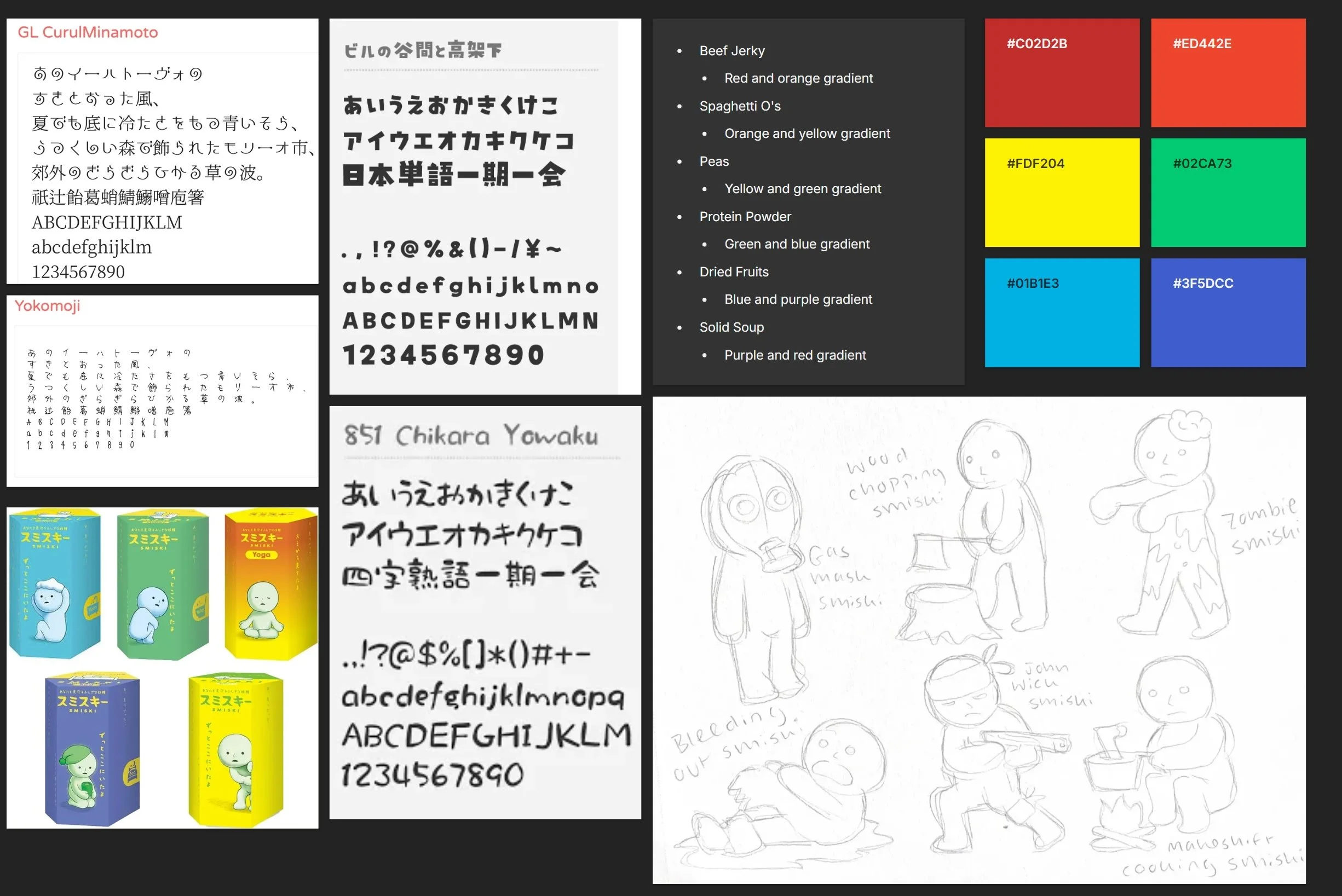
The third project for my Product Environment Material class was to make a packaging design for a wacky, made-up food. My idea was to somehow incorporate this made-up food into the packaging design of one of my favourite collectibles, “Smiskis”. I decided to imagine the iconic hexagonal shape as a can and created a Smiski set based on the apocalypse. The flavours are all inspired by stockpile canned foods and are meant to not sound very appealing.
“Food” Packaging Design
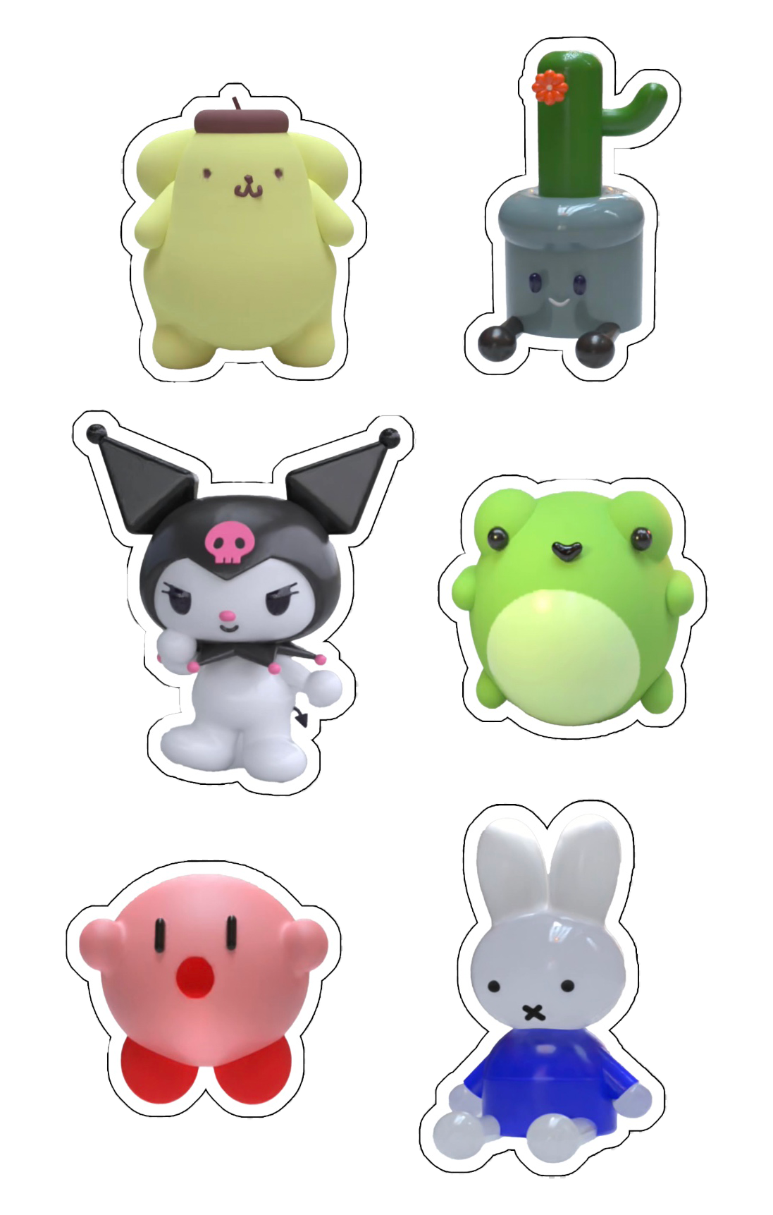
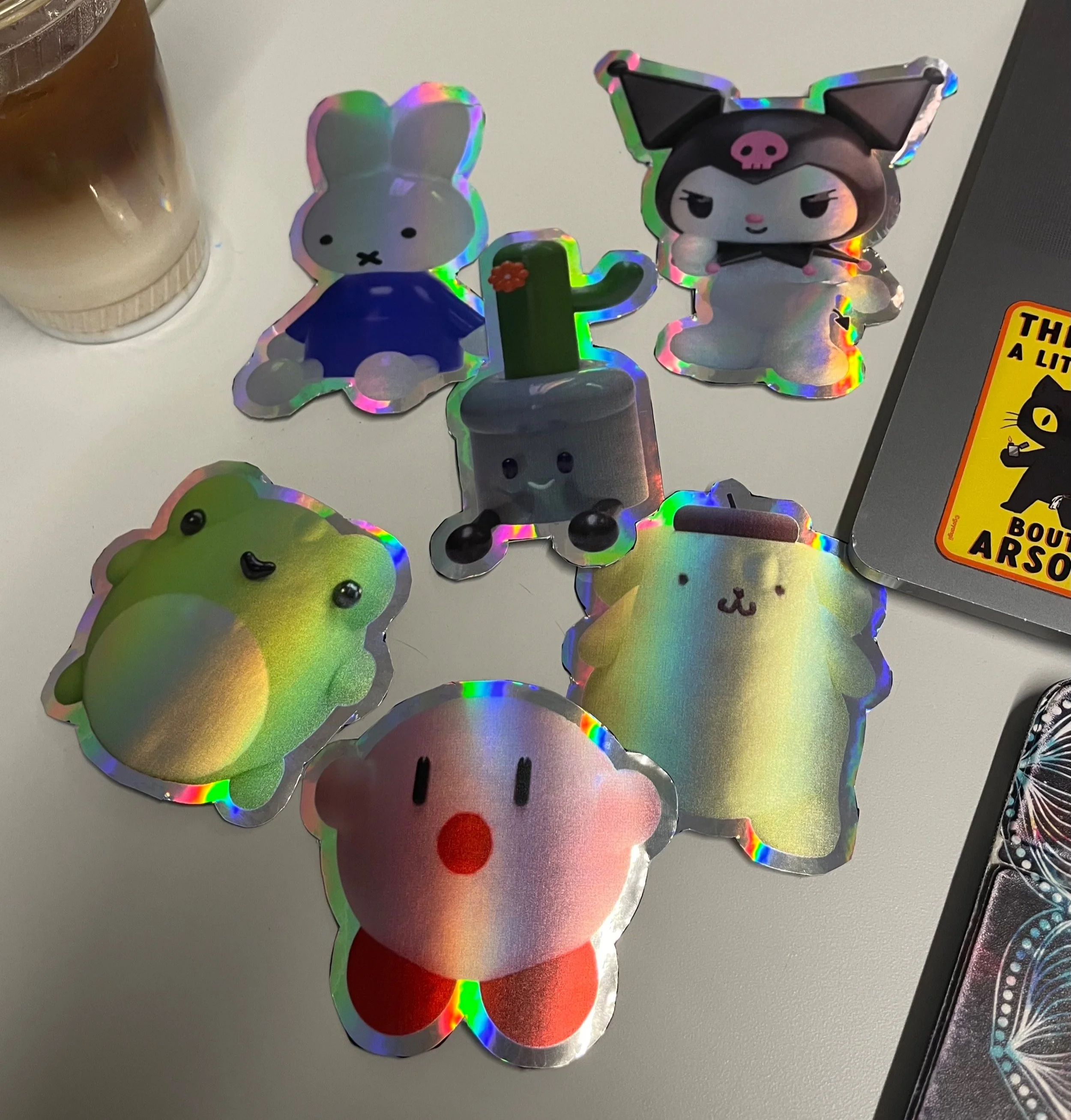
In my second Visual Communication class, we were challenged to utilise mediums we would not normally gravitate towards for most assignments. On one particular week, I used the 3D modeling software Womp to recreate figurines and trinkets I had in my room, which I then made into 2D pngs so I could print them as holographic stickers, which was something I had never done before but had always wanted to learn.
3D Modeled Trinkets
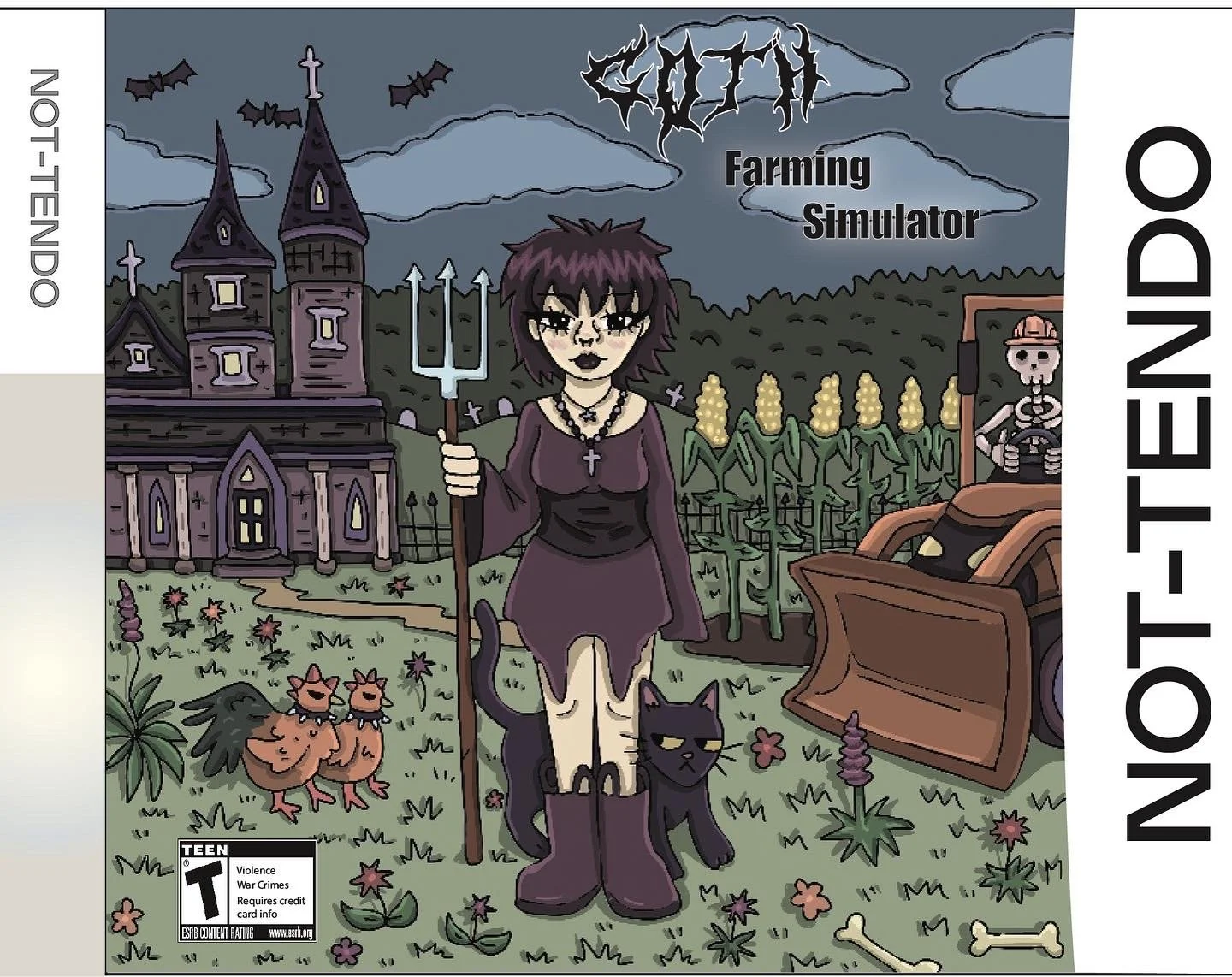
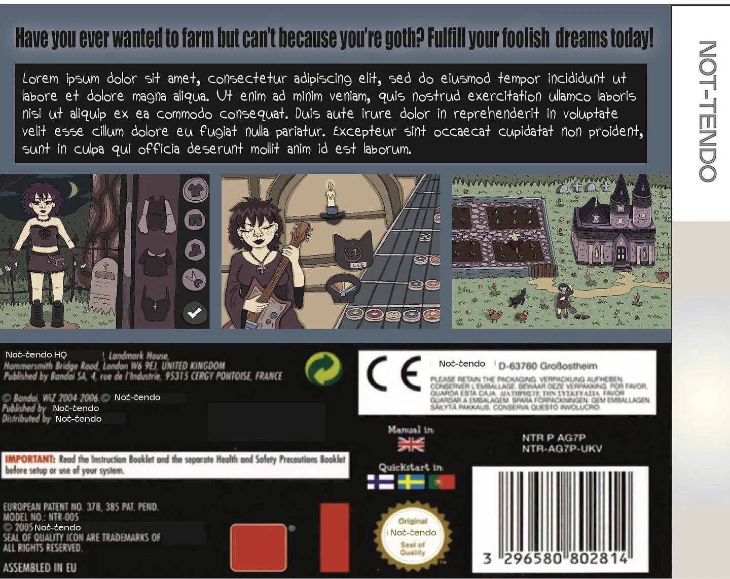
My final for my Illustration Intensive 2 class was simply to make a design for a product, incorporating at least three illustrations. Pulling from a narrative I developed the year before in my Digital Prototyping class, in which I made animations revolving around said narrative, I tweaked it accordingly to make a spoof Nintendo game. Because a lot of my work up to that point was very colorful, during this semester I experimented more with neutral, muted colour palettes, as seen in projects like this one. I pulled a lot of inspiration from video games I played as a child, like Guitar Hero, Stardew Valley, Barbie dress-up games, etc. as I wanted to give the viewer a good idea of what this game would actually be like.
Goth Farming Simulator
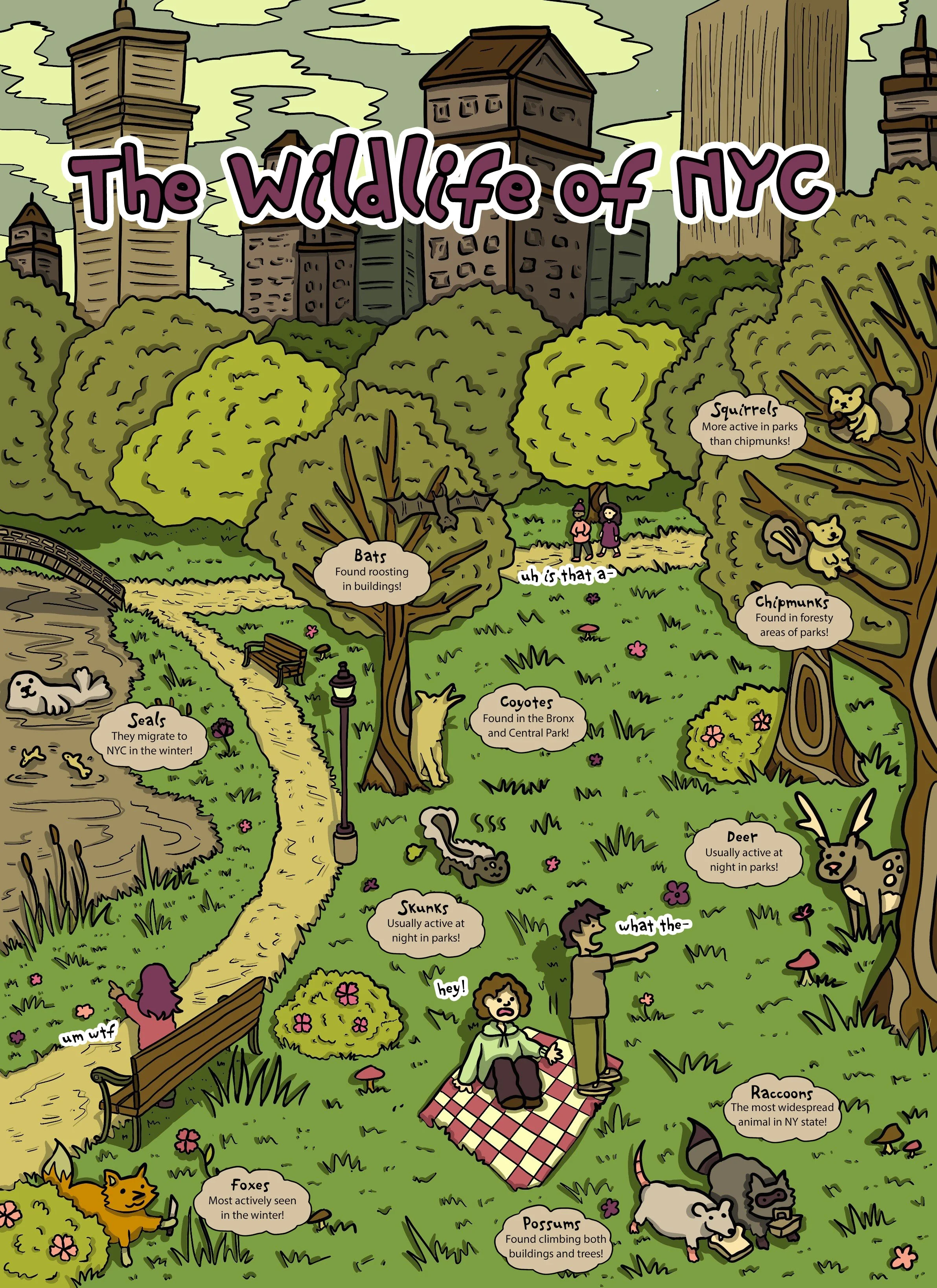
Illustrative Infographic
For my Illustration Intensive 1 final, we were tasked with creating an infographic, which could be about anything. Because of my love for animals, I chose to illustrate animals in NYC, and where one could find them. I specifically wanted the animals to be all within a scene, so that there would be more movement throughout the piece, and to emphasize the character of each animal.
Basketball Court Design
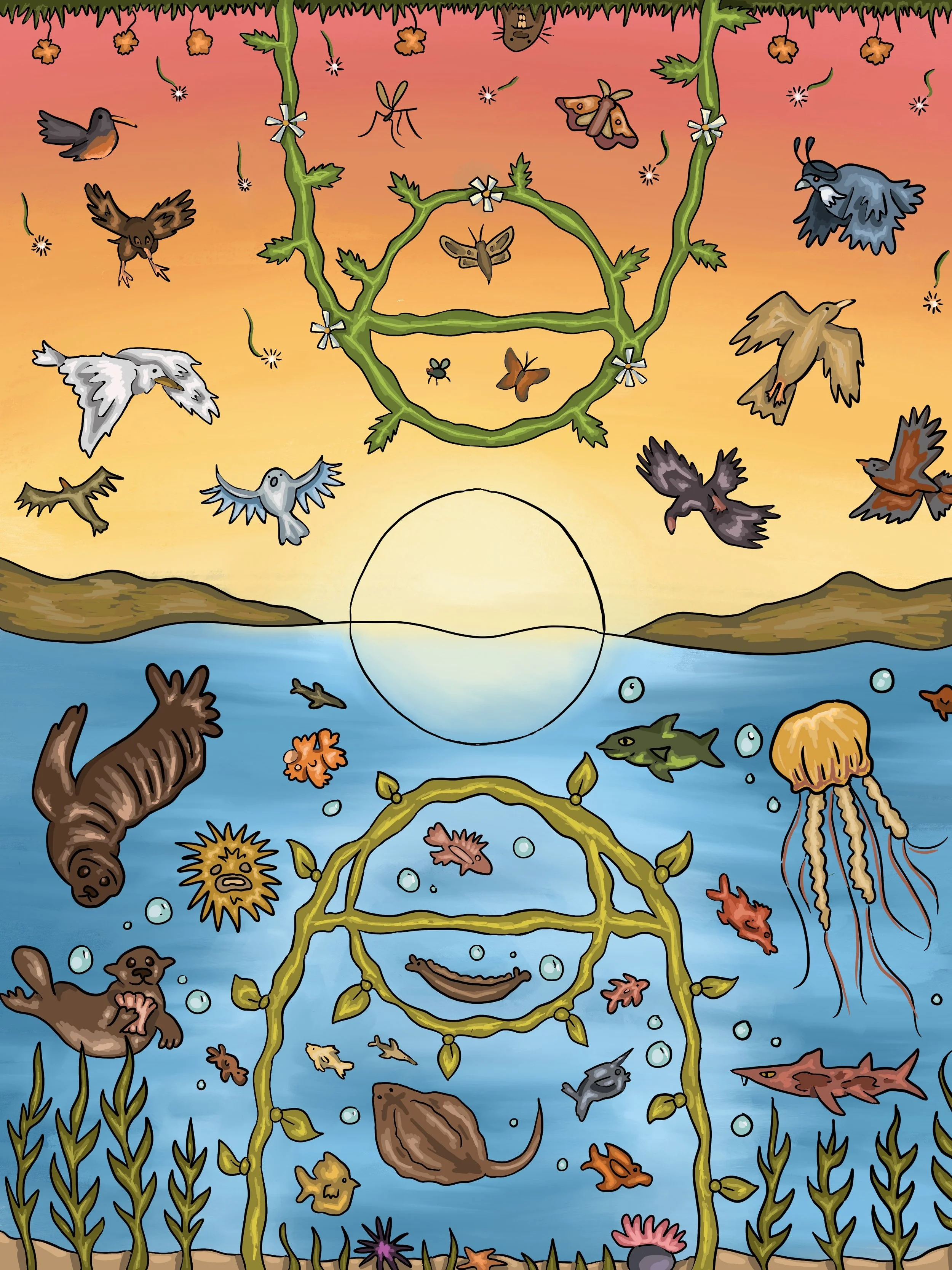
For the second project in my Product Environment Material, we were tasked with designing a sports field/court of choice. I was particularly thinking about the parks in my hometown during the ideation process, which are pretty barren and lackluster, and thus wanted to make a colourful design highlighting California wildlife. The bottom half of the court features Bay Area region-specific marine life, while the top half includes Bay Area-exclusive birds and insects.
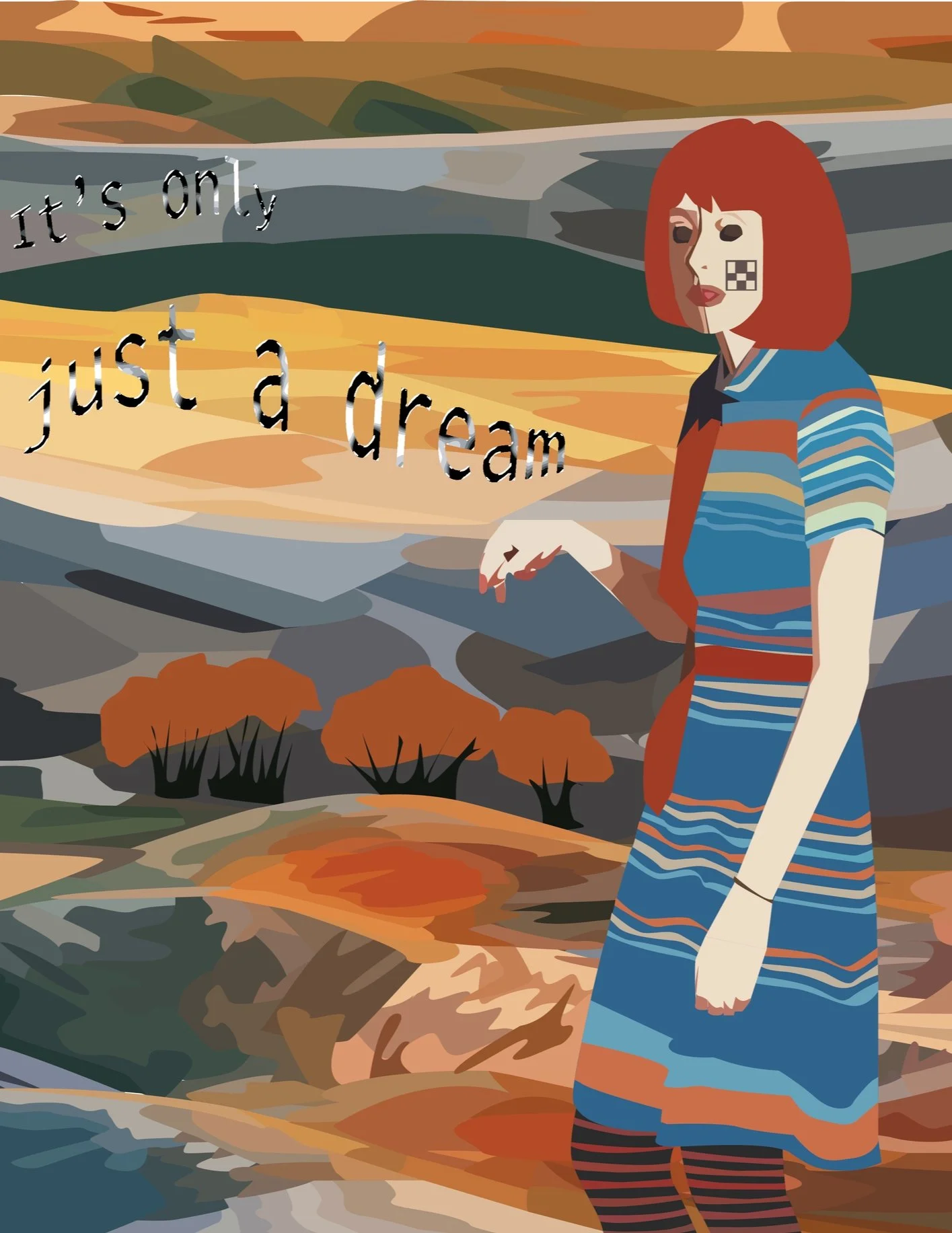
Surreal Digital Portrait
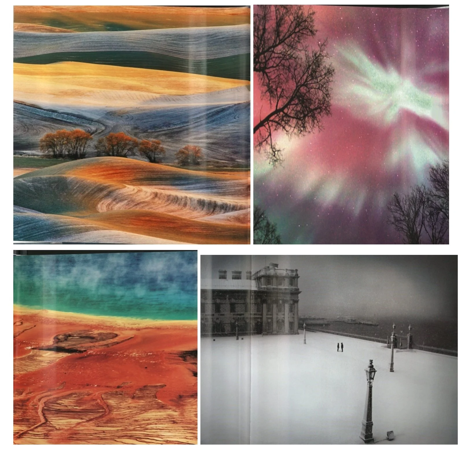
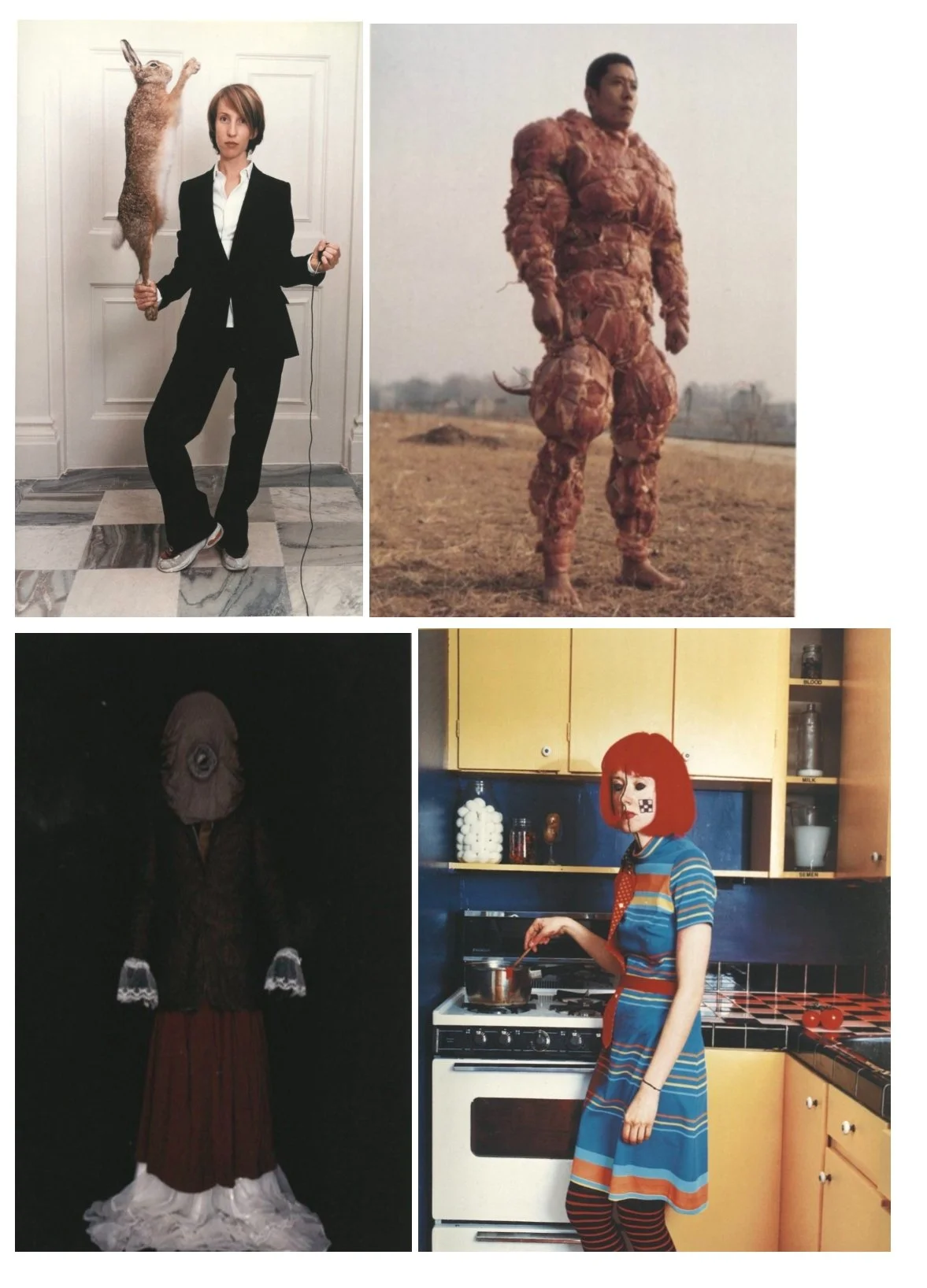
This was an earlier project done for my Process & Production class, in which we were asked to collage landscapes and portraits from photography collections in the school library to make into a vector illustration. I purposely chose the strangest portraits I could find and played on the surreal nature of the piece when asked to add typography at the project’s last stage.